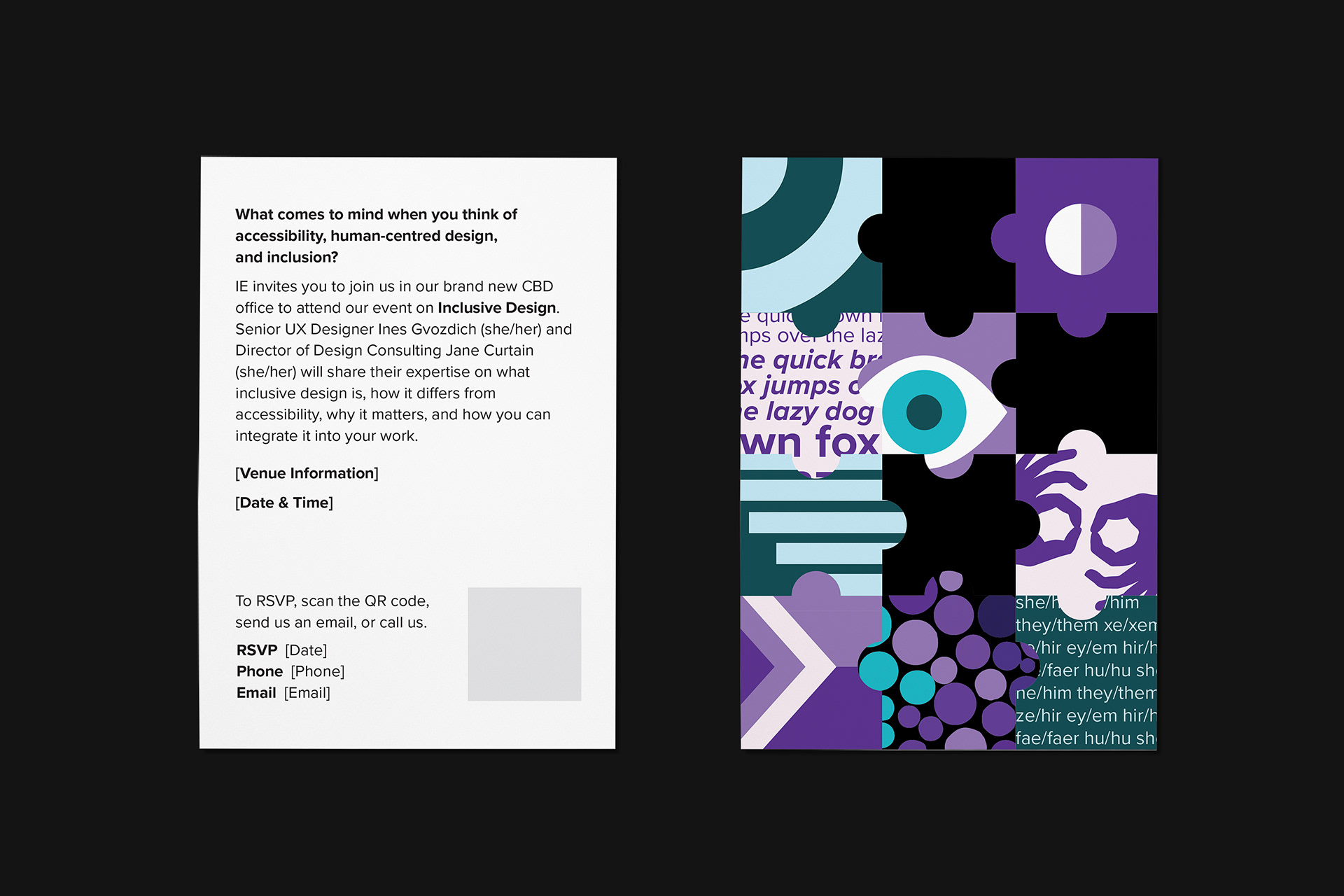
Series of Internal Artwork and Copy Proposals for Invitation - Style 01
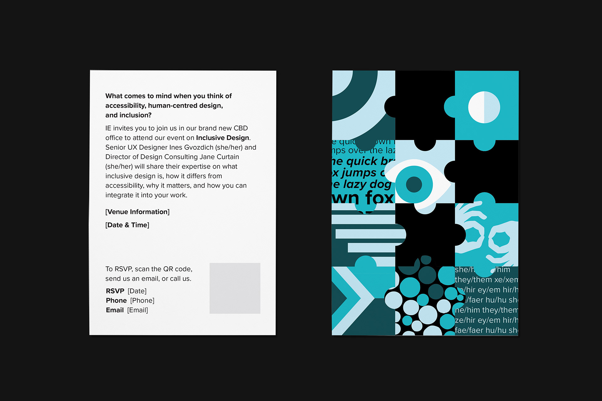
Series of Internal Artwork and Copy Proposals for Invitation - Style 02
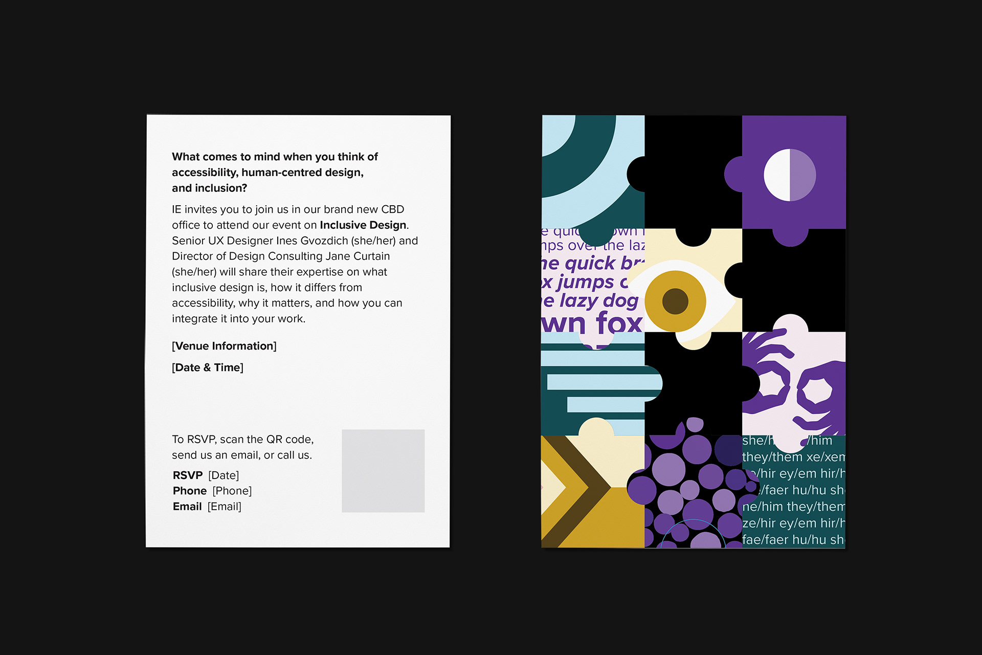
Series of Internal Artwork and Copy Proposals for Invitation - Style 03
IE Lunch & Learn "Inclusive Design" Invitation Mock-Ups
The IE “Lunch and Learn” invites are part of an internal company engagement I contributed to. “Lunch and Learn’s” are seminars hosted by IE, typically to 10 - 30 external stakeholders and clients affiliated with the consultancy. However, since the start of the pandemic, they have been hosted internally, so trying to find a way to encourage and spruce up the attendance of an in-person external seminar was the aim.
The upcoming theme of this “Lunch and Learn” was “Inclusive Design. More specifically, how to inspire technology leaders to incorporate inclusive design processes of how they build products for as many people as possible, to progress relationships with current and potential customers and gather qualitative insights into these customers.
My role in this project was to mainly design the appearance of the printed version of the invitation and work on early iterations of the digital/web platform invites/RSVP.
Initial Card Lenticular Iterations of IE Lunch & Learn Invite
During the very early stages of the project, I was the sole person producing the invites, using Moire Patterns and Analog Lenticulars as a source of inspiration for the art direction. I attempted to create an animation relevant to the topic and IE's brand yet also intriguing and printable on tangible material. Although the task direction and purpose of the project later evolved to something broader when the team of one grew, the video is a compilation of passes and attempts at lenticular patterns/imagery I was exploring.
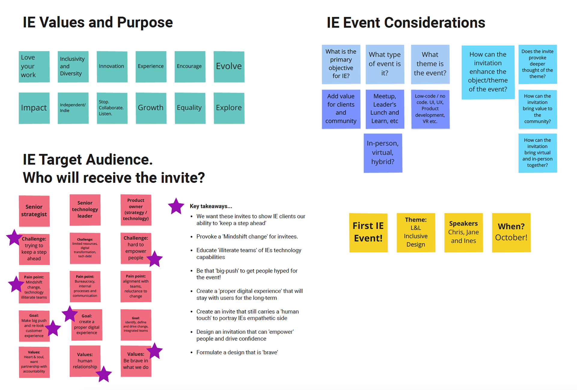
What Are IE's Values? What Will The Event Entail?
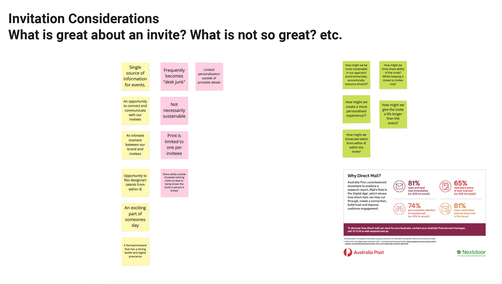
What Should Be Considerations For The Invitations?
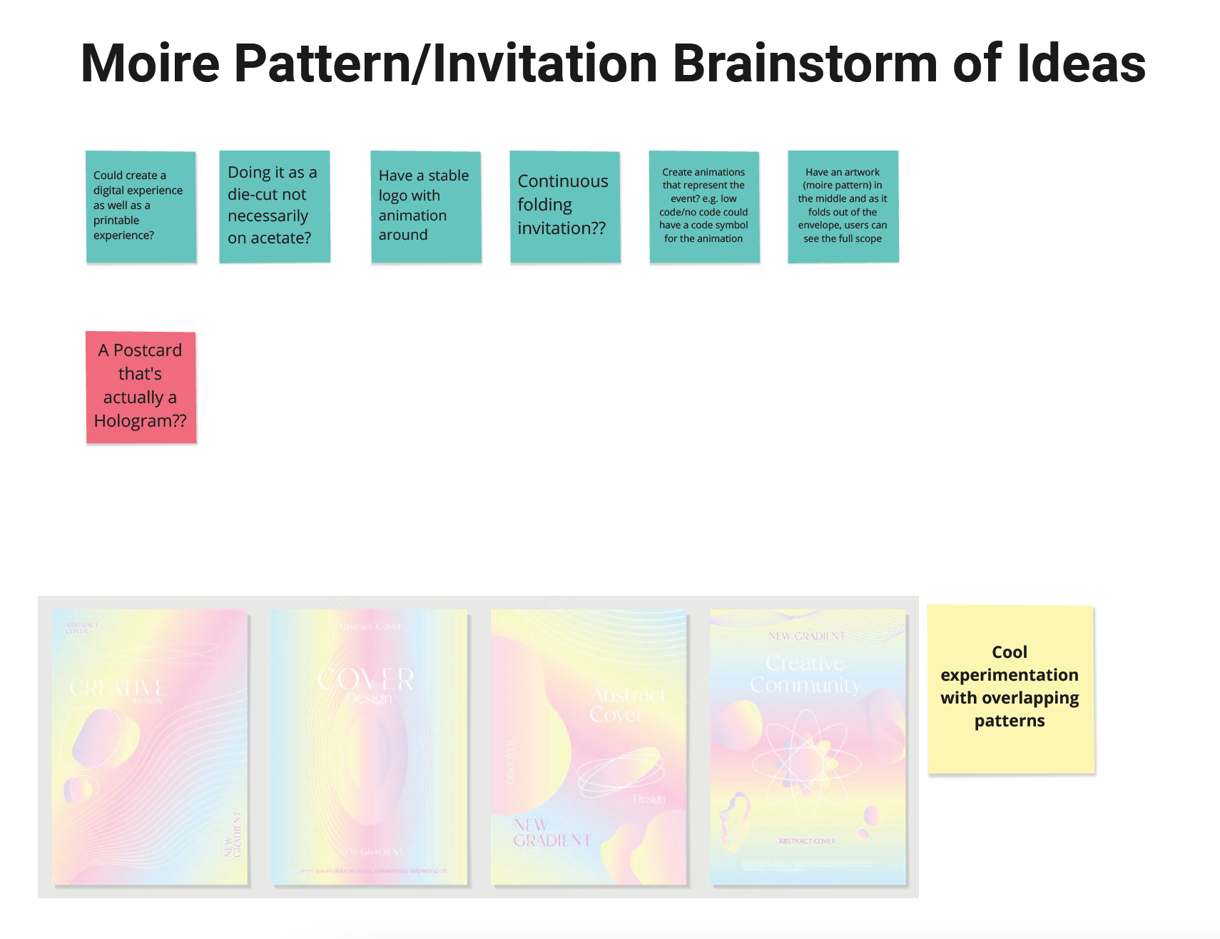
Moire Pattern Brainstorm Of Broader Ideas
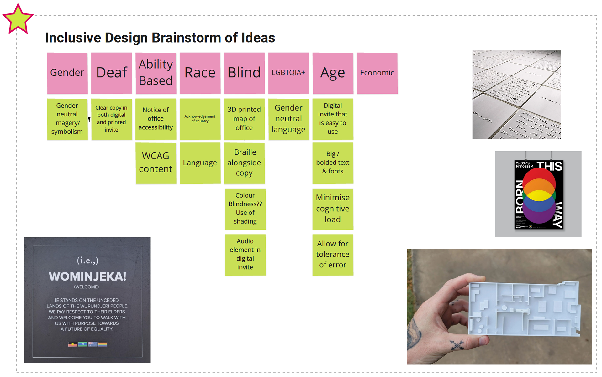
Inclusive Design Brainstorm
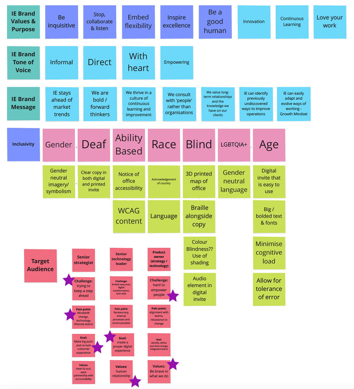
Accessibility and Inclusivity Traits
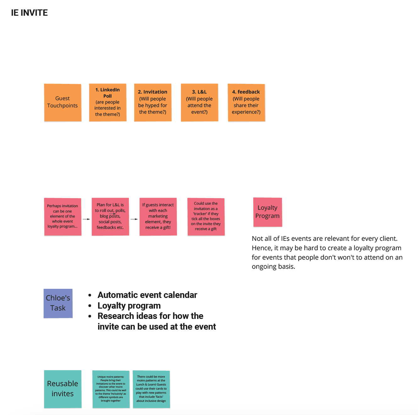
More Invitation Considerations
Ideation of What Inclusive Design Is and How the Invite Should Integrate IE's Brand and Values
From the project's evolution the team needed to consider the invites greater purpose and role - the wants and the mandatories.
The wants:
+ For the invite to be beautiful enough to keep (an artwork of sorts or something reusable or with multiple uses).
+ To automatically sync with the invitee's calendar (embedding a tap or scan QR code system).
+ Have a big reveal (business on the outside, party on the inside).
+ Stay consistent with the brand identity outside and details on the specific event inside.
+ Extra functionality to benefit the recipient (e.g. calendar, picture frame, etc.)
The mandatories:
+ Align with the IE brand, values, and target audience.
+ Make it reusable and sustainable where possible (avoid unnecessary waste)
+ Deliver a combination of a physical and digital experience
+ Be bold and unconventional! Use surprise and wow factors to capture people's attention.
+ Communicate the event theme in the inside section (e.g. inclusivity).
+ Customise the inside component to each event's primary and secondary objectives.
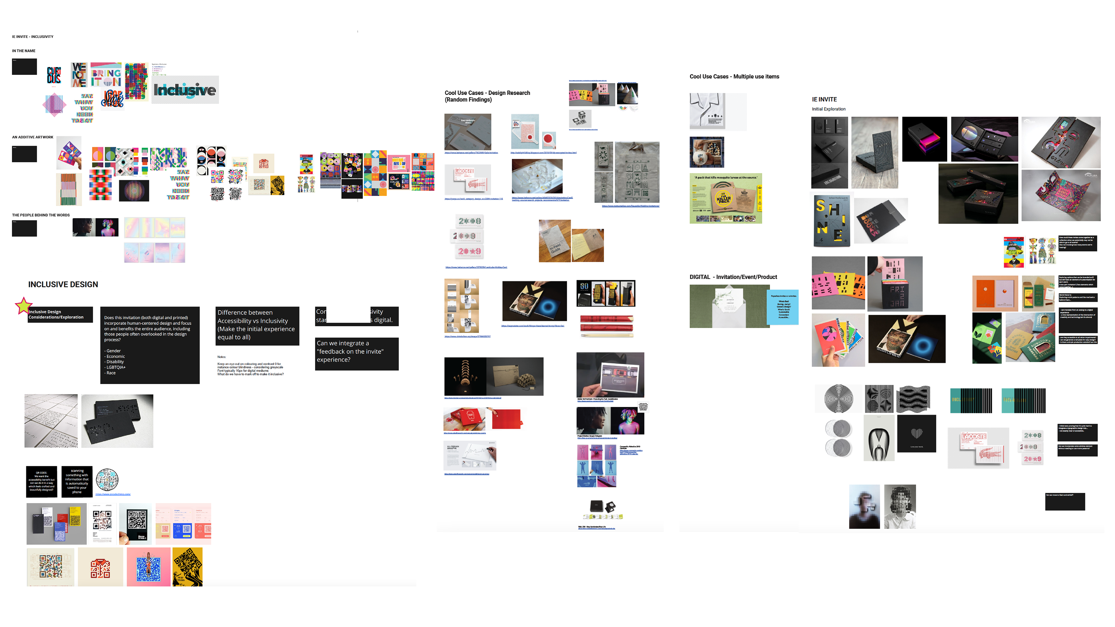
Intriguing Marketing Case Studies/Campaigns and Inspiration For Art Direction
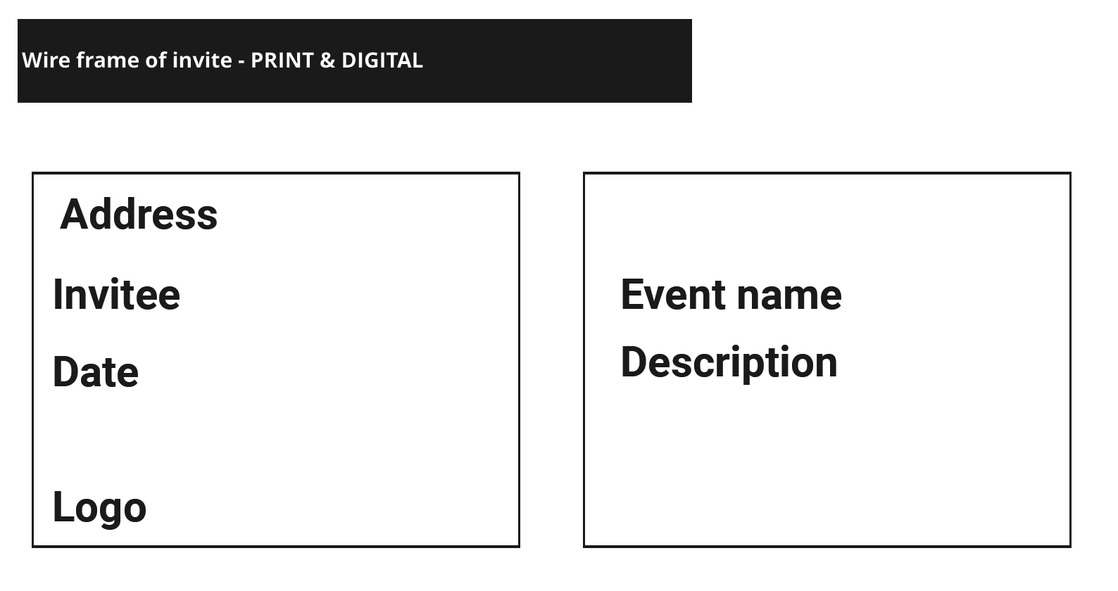
Early Iterations Of Print Wireframes

Important Event Details
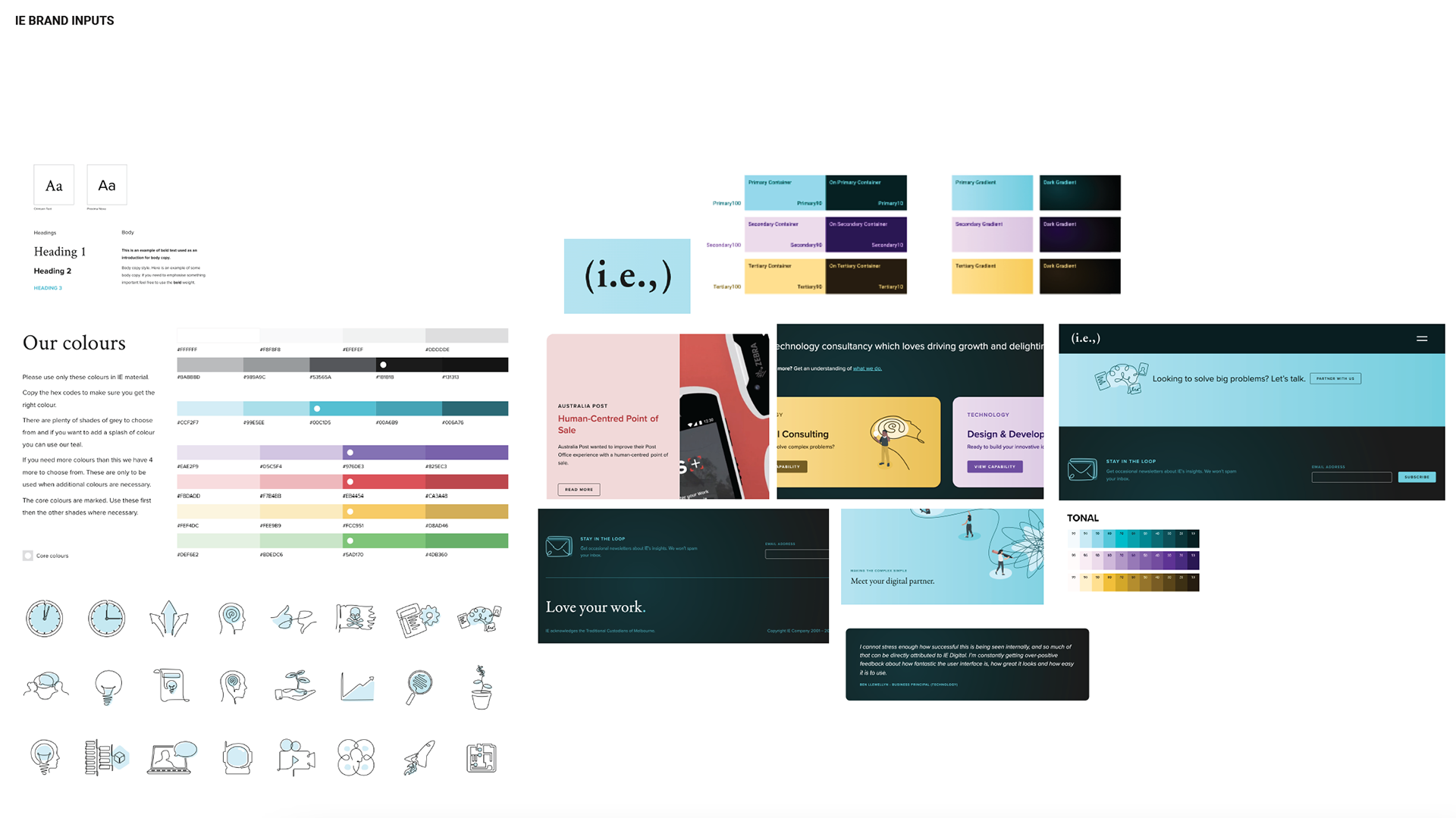
Extension of IE's Brand Update
Previous Case Study Research/Inspiration and Mandatories For Invitations
After coming to the above conclusion, I worked on creating the flow, layout/wireframes of both the print and digital experience and developing the "beautiful enough to keep" artwork for the inside component of the print invitation. The print version had an accompanying envelope incorporating die-cut and embossing elements as part of its exterior. The card (event details and artwork) sat inside with the various artwork colours aligned to the envelope die-cut holes. Due to timing constraints, we eventually ditched the die-cut feature because it didn't line-up very well with the colours and artwork I created.
The final artwork centred around symbols and visual cues that best represent inclusivity and accessibility. It was laid out as an unfinished puzzle to symbolise opportunity for improvement and future growth within the design space. Some visuals represented in the cover artwork consist of identifiable attributes of various forms of blindness, deafness and acknowledgement of the LGBTQIA+ community.
The final exterior envelope features the embossment of the IE Company name accompanied by the address and customised RSVP QR code featured on the back.
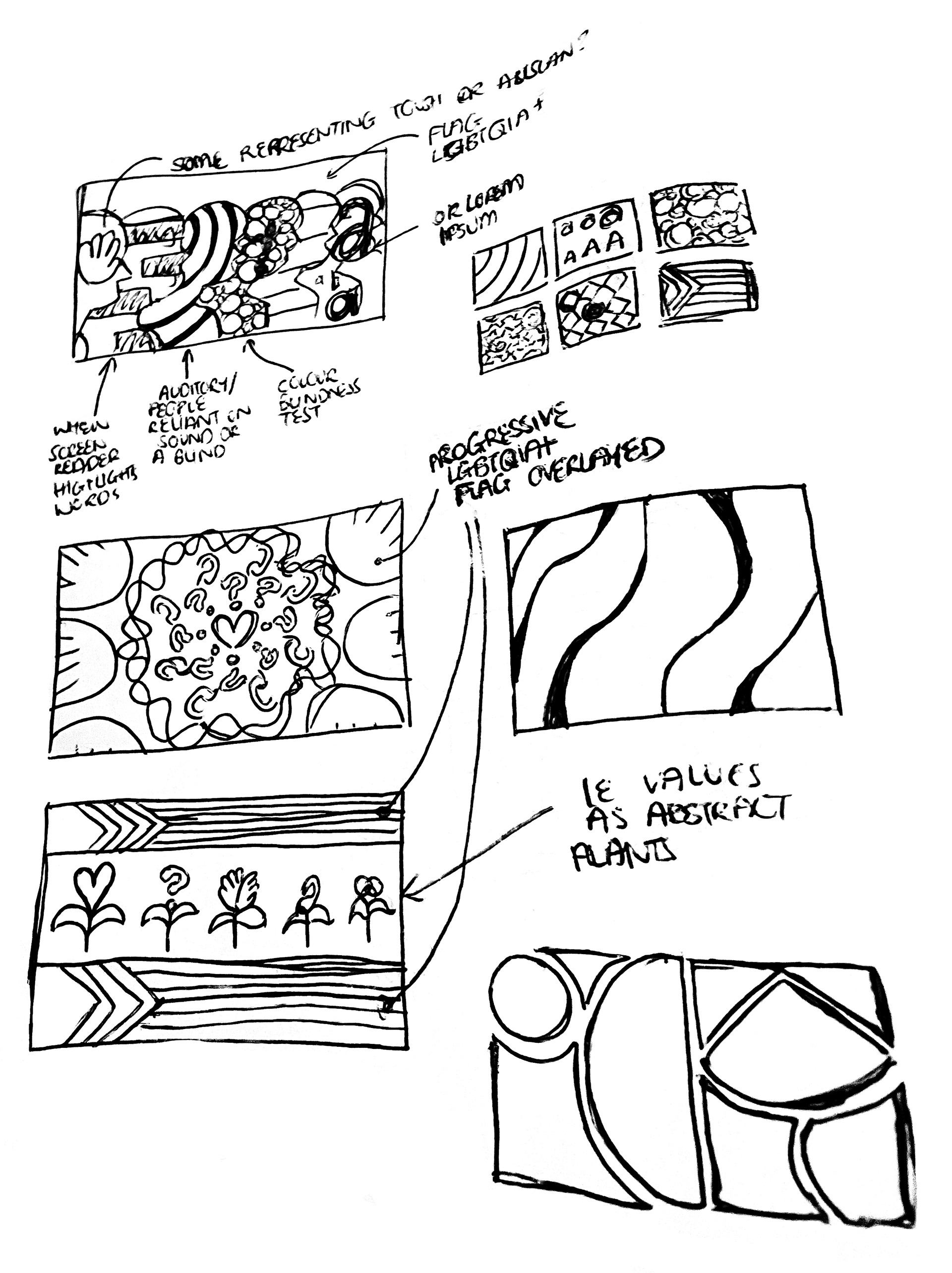
Interior Artwork Iteration - 01
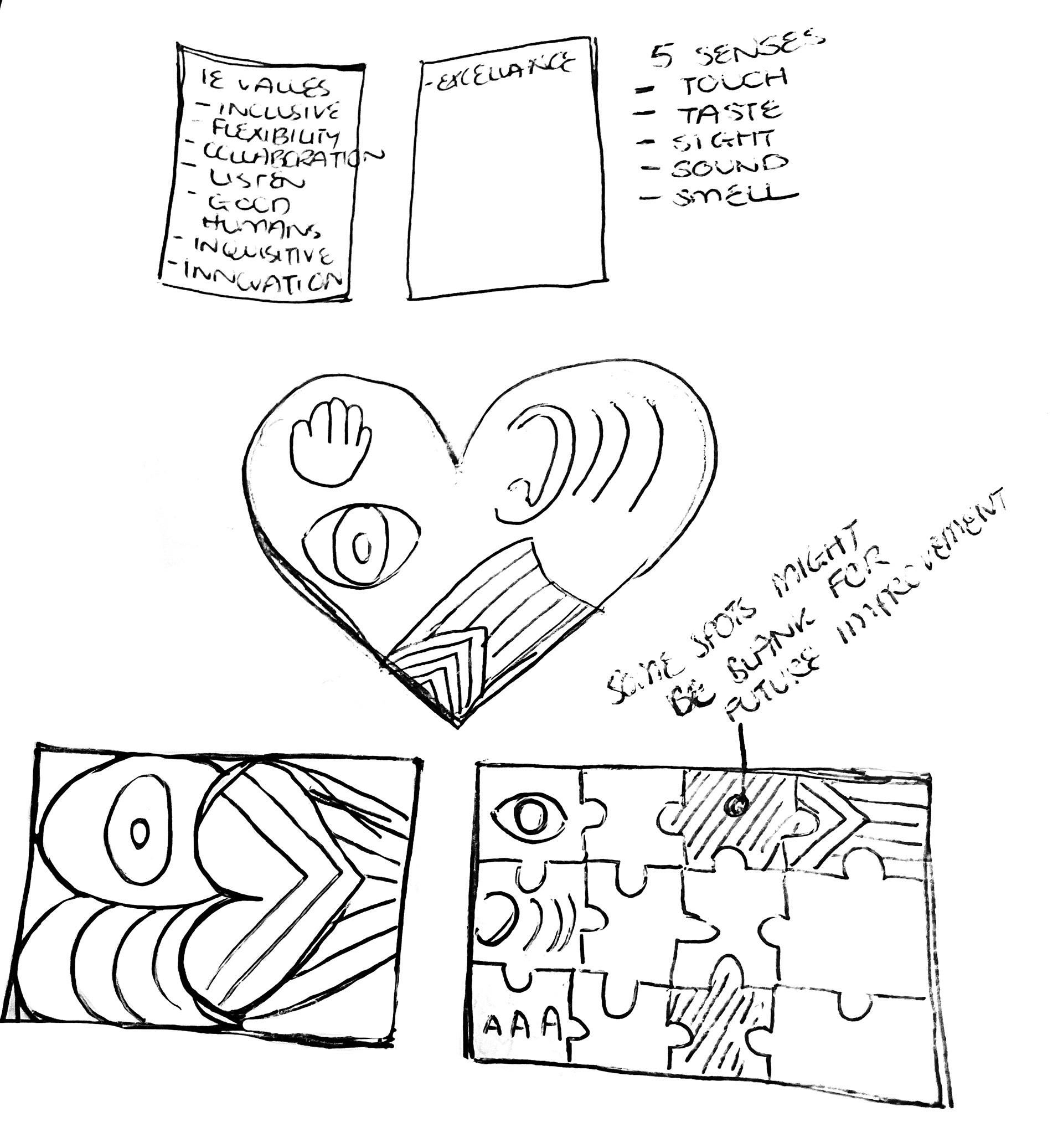
Interior Artwork Iteration - 02
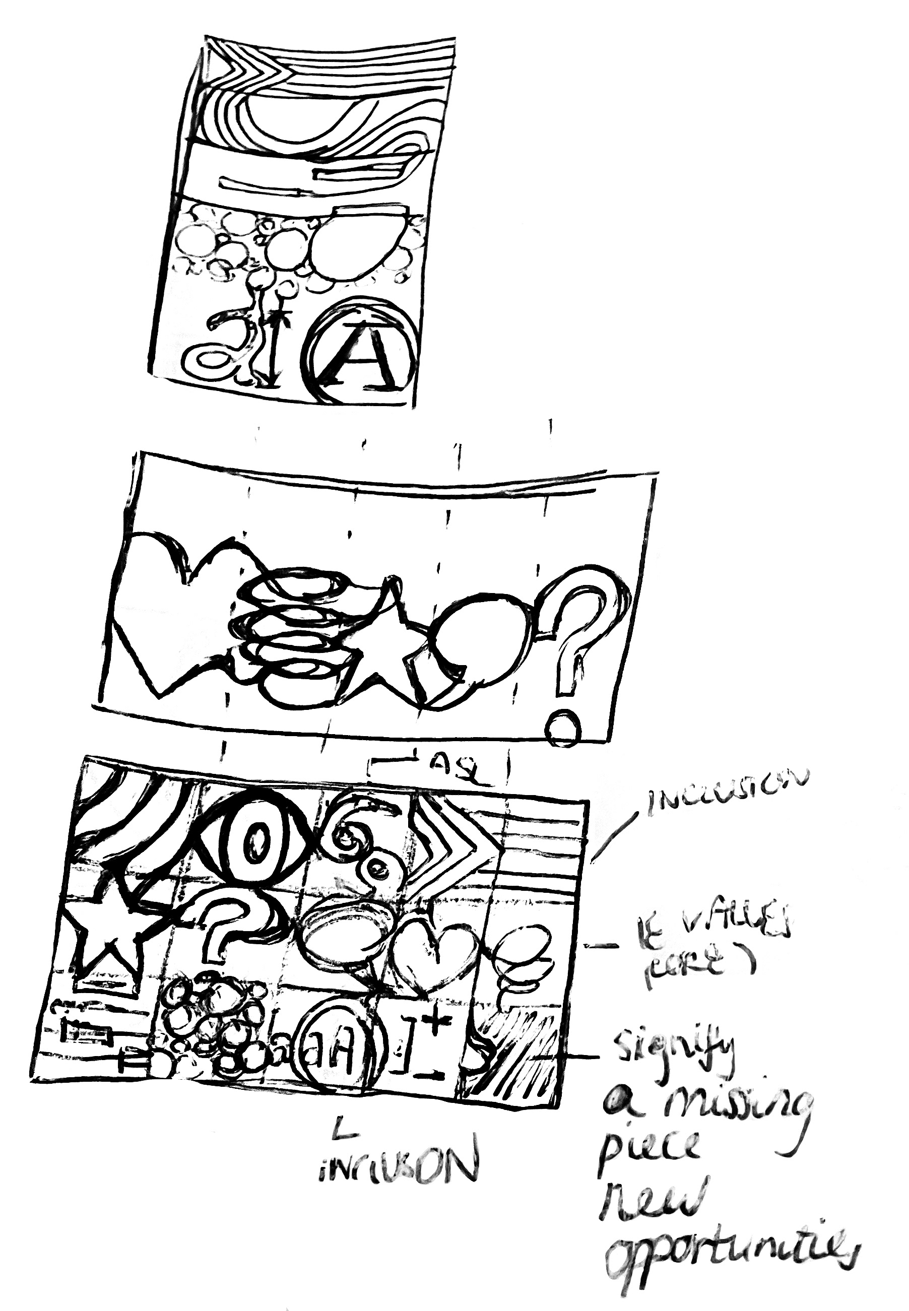
Interior Artwork Iteration - 03
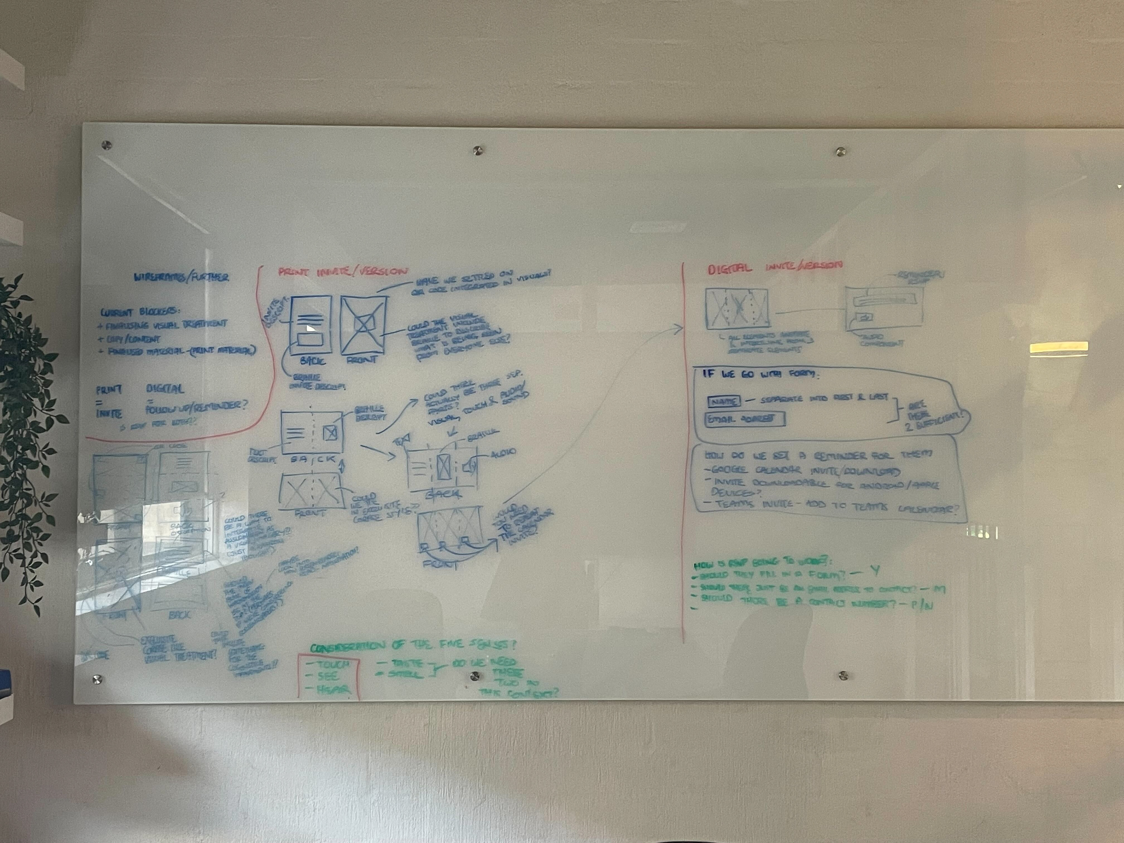
Print and Digital Experience Wireframes - Part 1
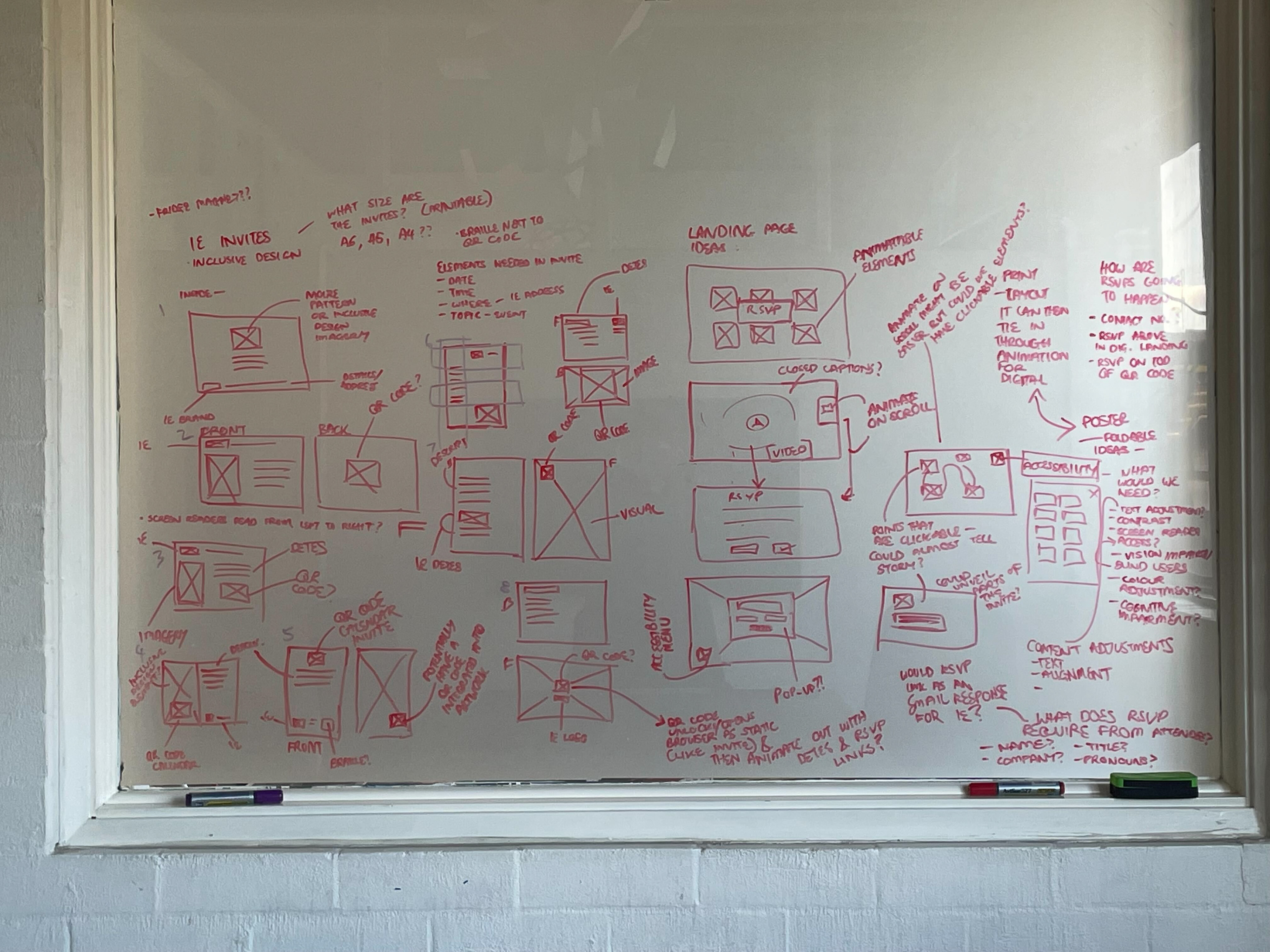
Print and Digital Experience Wireframes - Part 2
Print Invitation Interior Artwork Ideation and Wireframe Ideation
